Hiki.Team
Maker · 2018–2020
Conversational Interface Design, Product Design, UX Writing
Hiki was a Slack-based skill directory for distributed teams. I developed the concept, lead the design of its command-line interface, contributed to the HTML and Sass code base, wrote the website copy and created marketing materials. Despite a promising start the product did not attract enough users and was discontinued 18 months after release.
Background
Hiki was conceived out of a desire to develop better awareness about your teammates’ skills. Especially in the context of the larger, distributed teams, it wasn’t always apparent who the right people to talk to about a specific topic were. This made it harder to develop working relationships, especially for new team members, impacting team morale and productivity.
We wanted instead to put a system in place that would turn online profiles into richer, more pliable and more personal portraits of who individual team members actually were. Something that would help teams get to know each other better and bring them closer together. Even if they were thousands of miles apart.
Minimum Viable Product
The product we envisioned was a skill directory for Slack. Team members would be able to tag each other with skills in any channel or group chat, each tag adding to the person’s individual skill profile, as well as the profile of the team as a whole. Skills could also be up- or down-voted to reflect the relative expertise of each team member.
We considered the following 3 main use cases:
- Giving and getting credit for contributions
- Finding colleagues to ask for help or socialize with
- Seeing what the team is capable of
We decided to build the product as a Slack add-on to enable teams to easily access and update their skill profiles without the need for context-switching. We believed that integrating the product with existing workflows this way would enable us to reduce friction and help drive product adoption as well as user engagement.
A Word About Branding
After some initial detours, we’ve landed on the name Hiki, which is Hawaiian for “to be able to.” It was also a play on the word “wiki,” intended to reflect the crowd-sourcing nature of the product. Most importantly, it was a short, easy to spell and pronounce name that felt fun and playful. Of course, the resemblance to the word “hickey” was not lost on us. But we thought the risqué connotation was worth it, as we were hoping the similarity would make the name more memorable and easier to recall.
Command-Line Interface
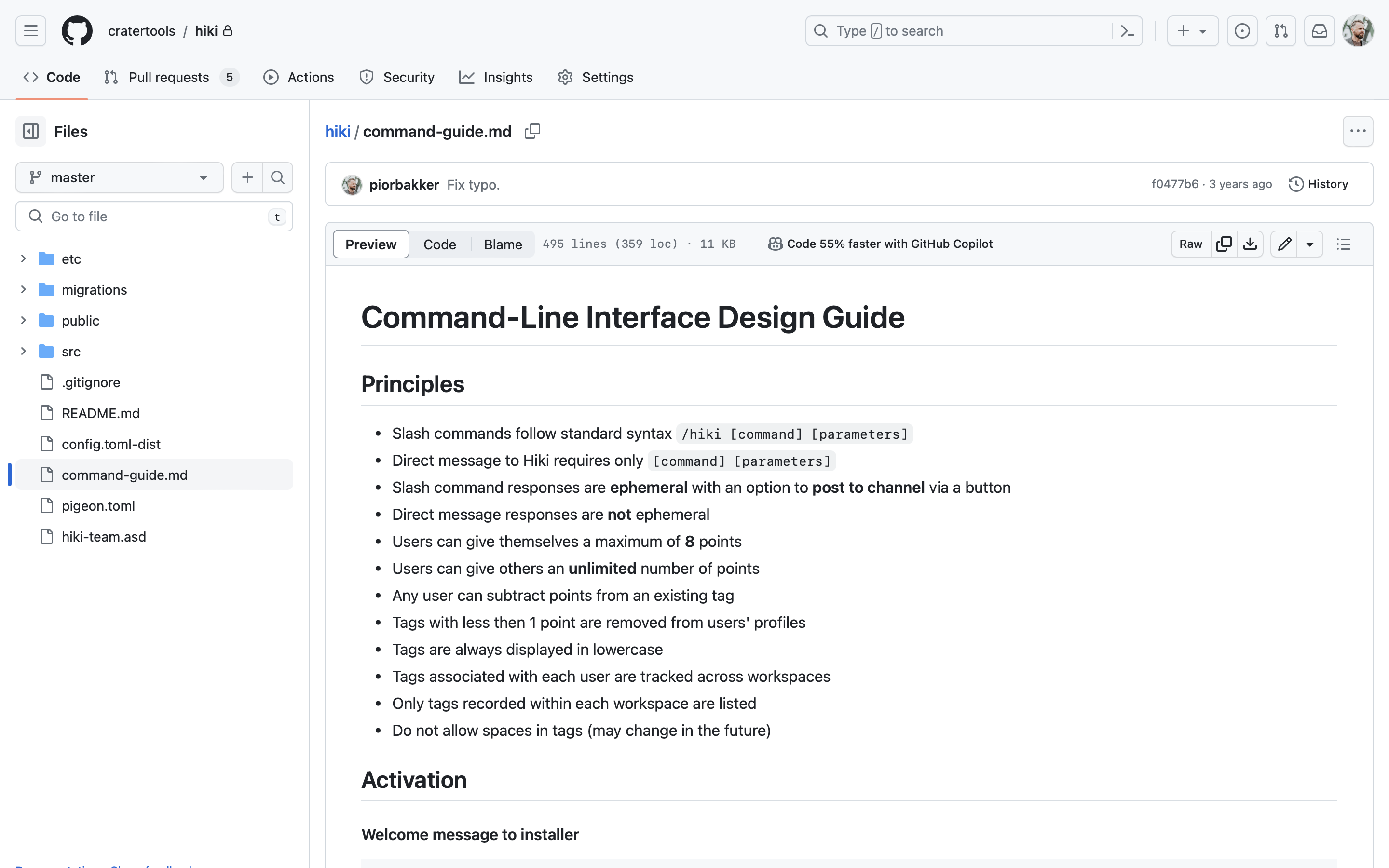
We opted for a command-line interface as the mechanism for user interaction. Back then, Slack did not offer graphical user interface components to 3rd party apps, whereas a conversational interface based on a dialogue tree alone was hard to work with and relatively cumbersome to use. We saw a command-line interface as a promising solution, striking a balance between flexibility to facilitate different functions and a user-friendly experience.
The syntax we settled on was /hiki [command] [parameters], where /hiki was the slash command used to initiate the app inside of the Slack client, [command] was one of the pre-defined actions users could take, while [parameters] were the values, such as usernames and/or skills, users assigned to each command.
In total there were 6 actions users could perform:
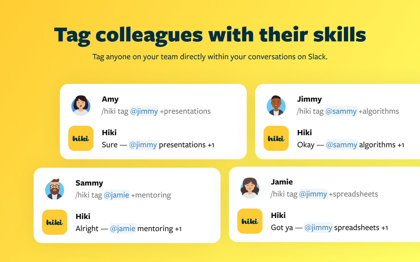
/hiki tag @username +[skill]to upvote a user’s skill/hiki tag @username -[skill]to downvote a user’s skill/hiki listto list all of your team’s skills/hiki list [skill]to list everyone with a specific skill/hiki list @usernameto list skills of a specific user/hiki helpto look up commands and get support
For example, you could tag a teammate with a skill using the command /hiki tag @username +[skill]. Commands like /hiki list @username allowed you to view tags associated with a specific person, while /hiki list [skill] returned a list of teammates with a particular skill. When typing commands to Hiki in a direct message you could omit the /hiki slash command from the syntax altogether, for a more streamlined experience.
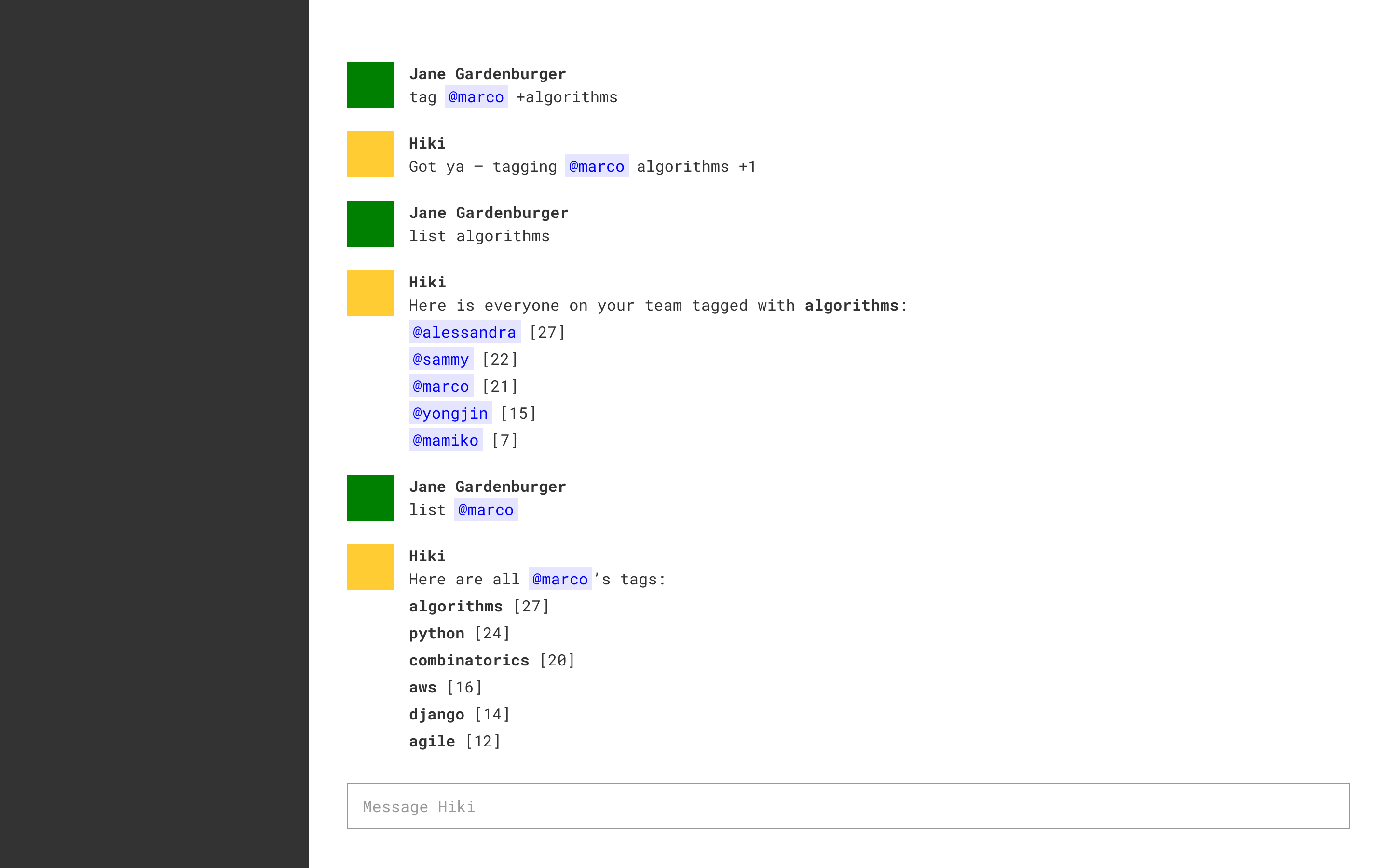
tag commands.
tag and list commands.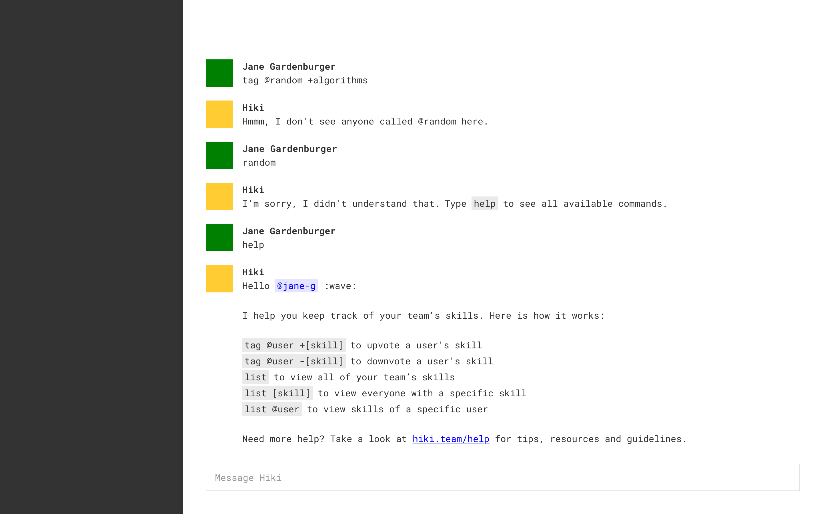
help command.Soft Launch
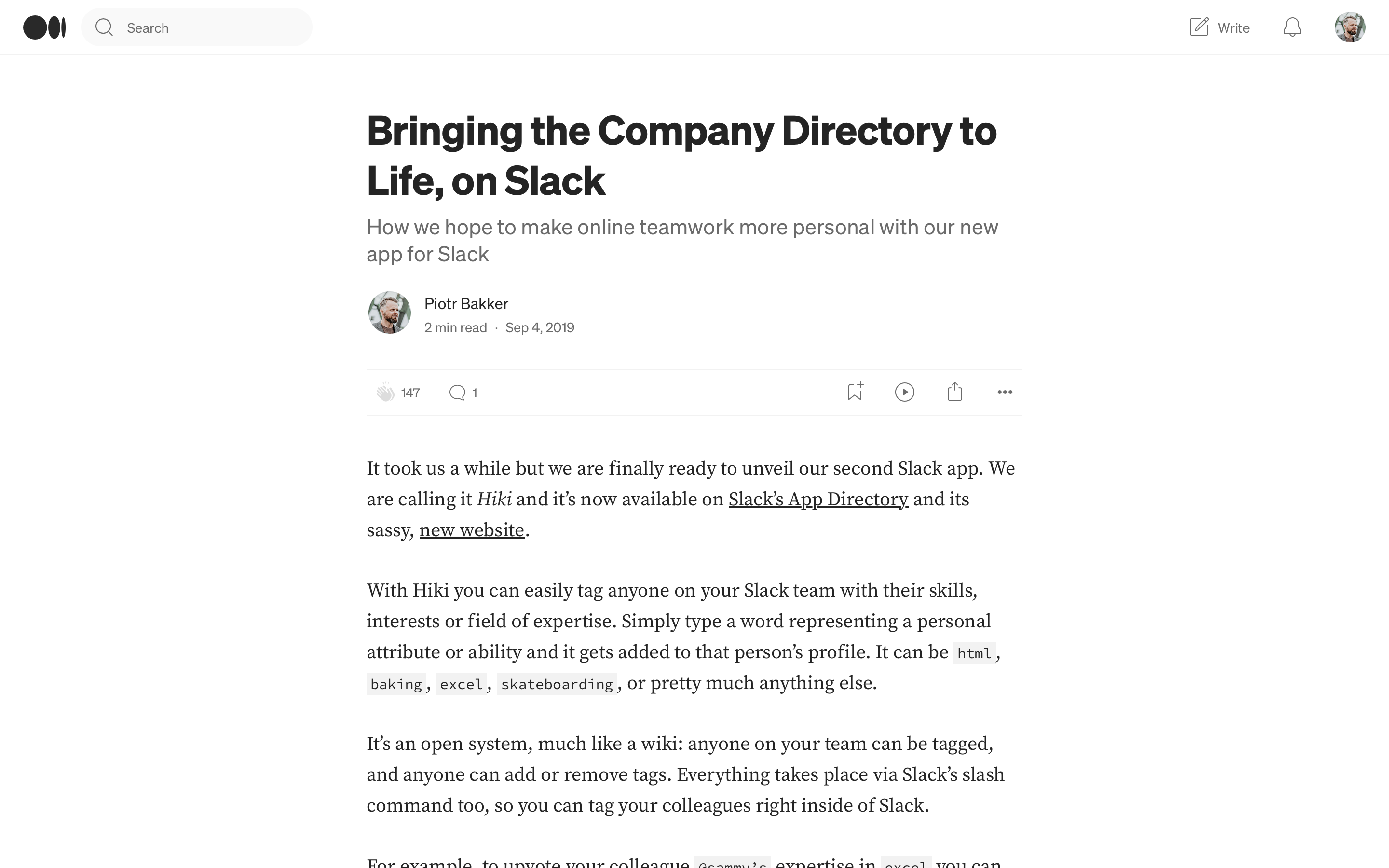
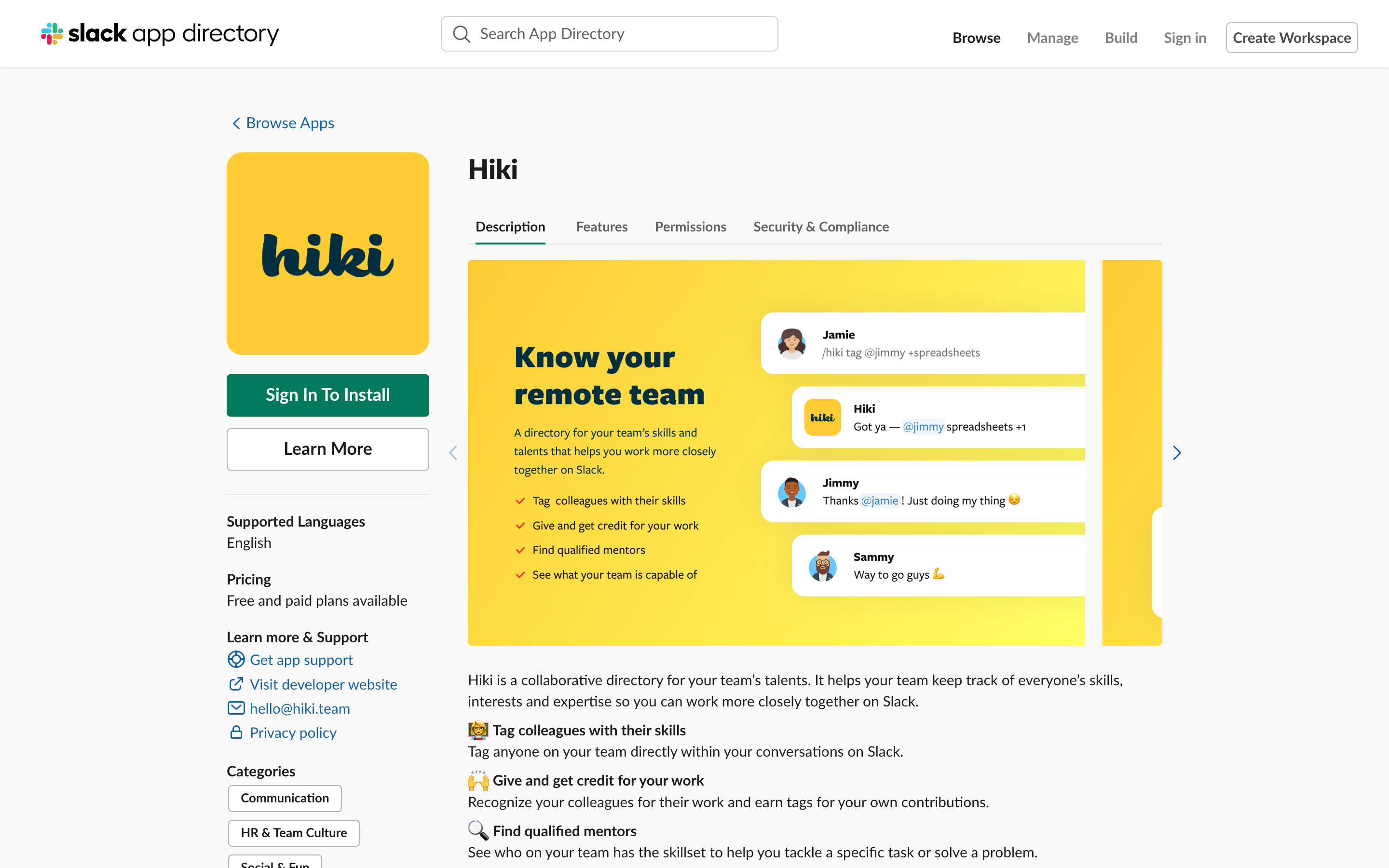
We chose to launch the product on the Slack App Directory without much of a fanfare to see whether the product organically attracted any interest from Slack alone. This was accompanied by a brief announcement on the company blog. We wanted to get some early feedback and iron out any bugs first, before commiting more time and energy to any promotional activities.


Postmortem
Although we’ve received promising feedback at first, including interest for an acquisition from another tech company, ultimately the product did not attract enough users to warrant further development. The issues that contributed to this most likely were (1) insufficient marketing and (2) usability issues associated with the command-line interface. Without any marketing the product struggled to find its audience, while the command-line interface may have been too hard to use, even for those who did find the product. The combination of these two issues proved to be too hard to overcome, given the limited resources we had, and we decided to shift our focus to GreetBot instead.