Mixbook.com
Freelance UI/UX Designer · 2016–2020
Design Systems, User Interface Design, Wireframe Design
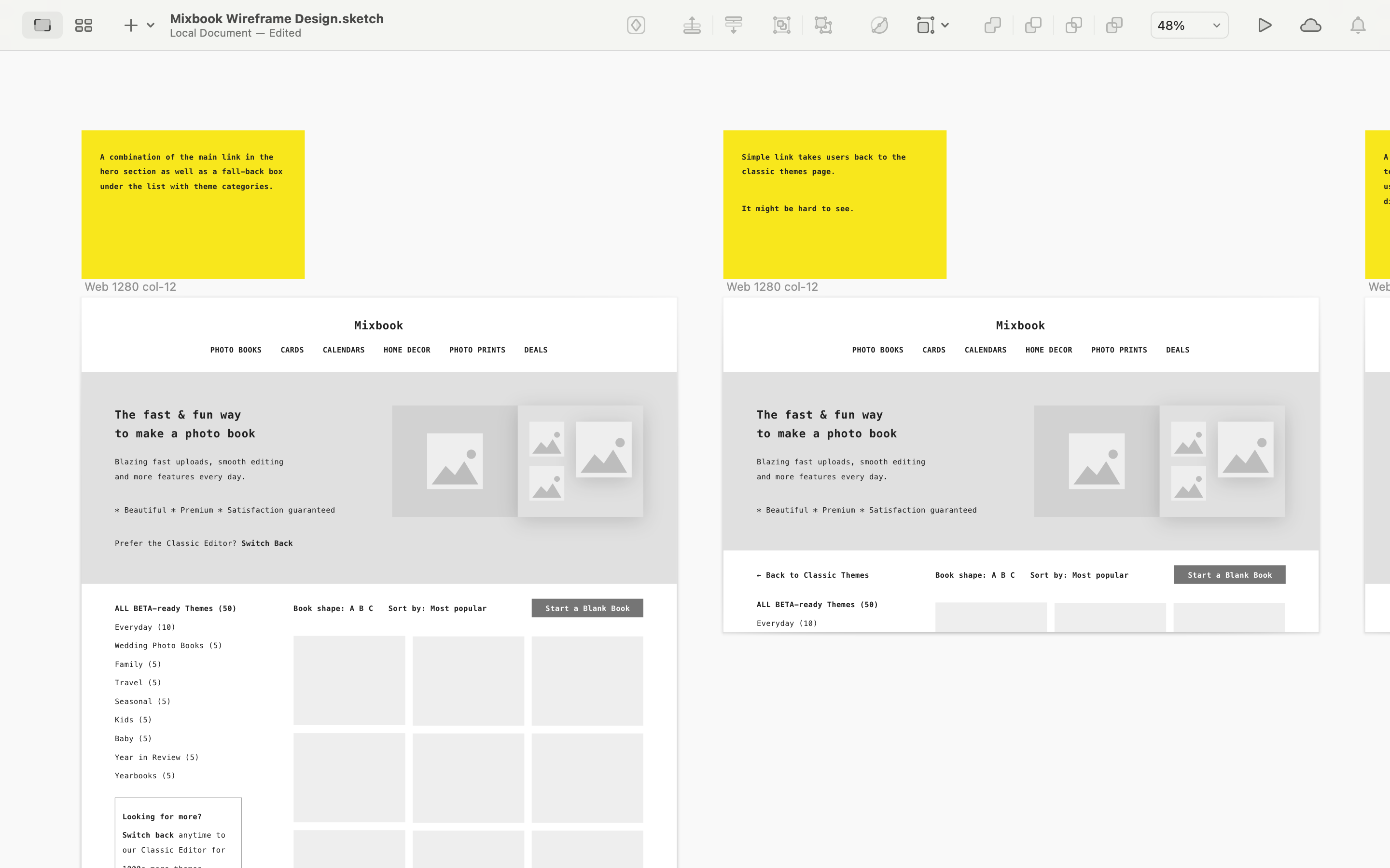
Mixbook brought me in to redesign their photo book editor during the company’s transition from Flash to HTML5. As part of the project I worked with the internal design and marketing teams to establish a new design system and visual identity, as well as to update various e-commerce pages, including storefront and checkout, using responsive web design principles.
Background
Mixbook’s core product, the web-based photo book editor, was originally developed using Adobe Flash. By 2017, though, the user interface was showing its age, hindering not just the overall usability of the product but also the development of new features and use cases. As the industry was moving away from Flash, the company decided to pivot sharply to HTML5 as well. The goal was to reboot the outdated user interface using modern frameworks and make it a seamless part of the Mixbook.com user journey.
Wireframe Design
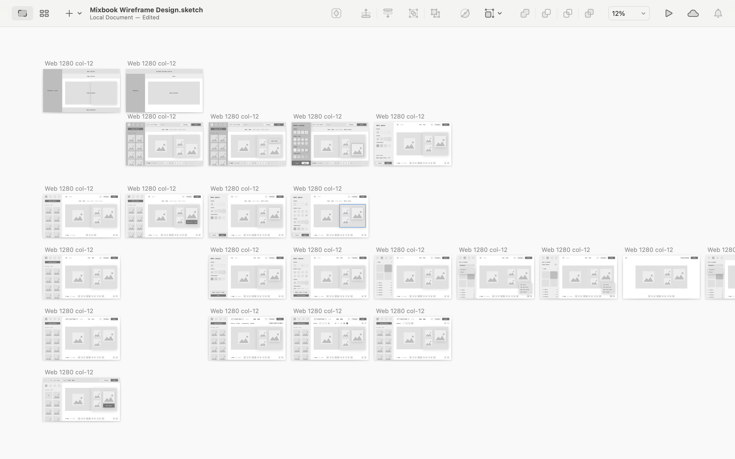
The photo book editor utilized a relatively dense user interface, as it included a wide range of features, from photo upload and management to page layout and styling. Wireframing allowed us to get a good sense of the information architecture, identify potential usability issues, and for me personally, to also develop a deep familiarity with the product.

User Onboarding
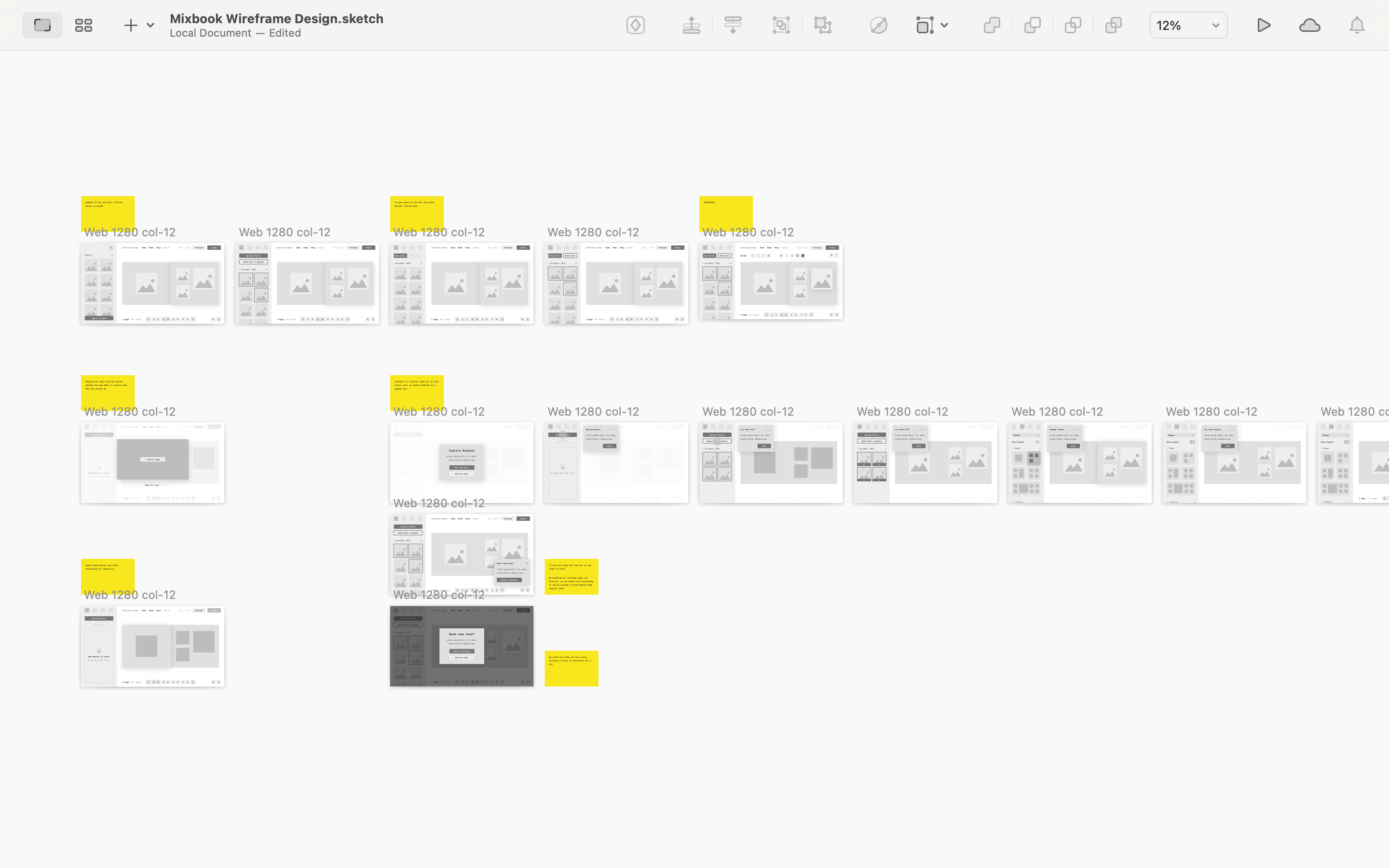
The new photo book editor wasn’t going to be a radical departure from the existing Flash-based product. Nonetheless, it was going to introduce a number of key changes, particularly in visual design. Hence, it was necessary to make the user onboarding an integral part of the transition. To make this process as seamless as possible I explored several different onboarding mechanisms, including interactive tutorials, personalized hints and tool-tips, feedback forms, as well as a dedicated landing page that showcased the major changes and improvements in the new editor.


Design System
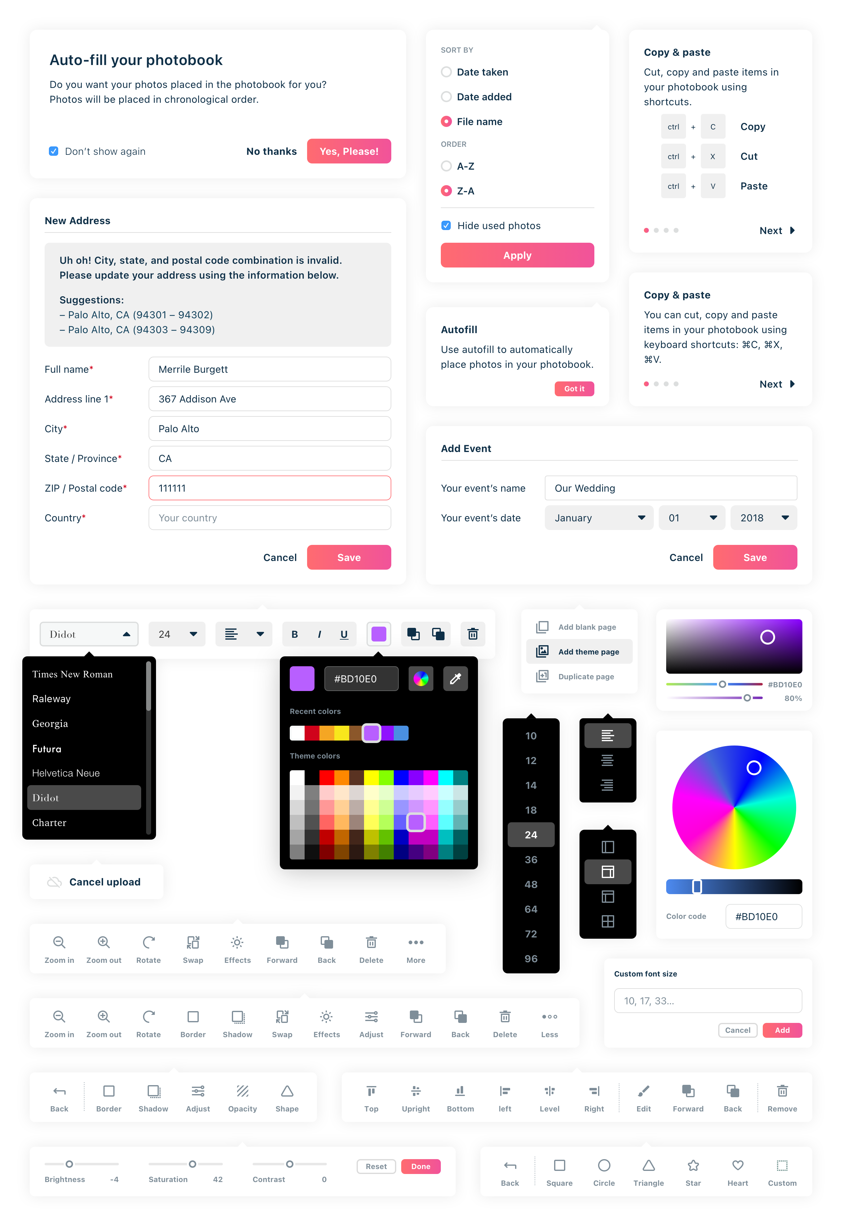
Setting up a design system was an essential part of the redesign project because the photo book editor needed to seamlessly integrate with a range of Mixbook’s e-commerce pages, including storefront and checkout. As the company was refreshing its branding at the time, including an entirely new logotype, color palette, and typography, it was essential that I collaborated closely with various stakeholders, including the internal design and marketing teams, as well as the PM on the project, to ensure we weren’t veering off into different directions.

Starting at the Core
Product redesigns require a great deal of preparation, research, and discipline. But you also need to know where to begin. As this project shows, a good place to start is usually the core of the user journey. Starting the design process there allows you to work on the most consequential, the most fundamental part of the product first, and thus to make as few compromises as possible. You then work your way back to other parts of the product. This approach creates not just a solid foundation for the core of the product, but also helps establish a seamless user experience overall.