Wizehire.com
Product Designer · 2020–2022
Design Systems, User Interface Design, Web Design
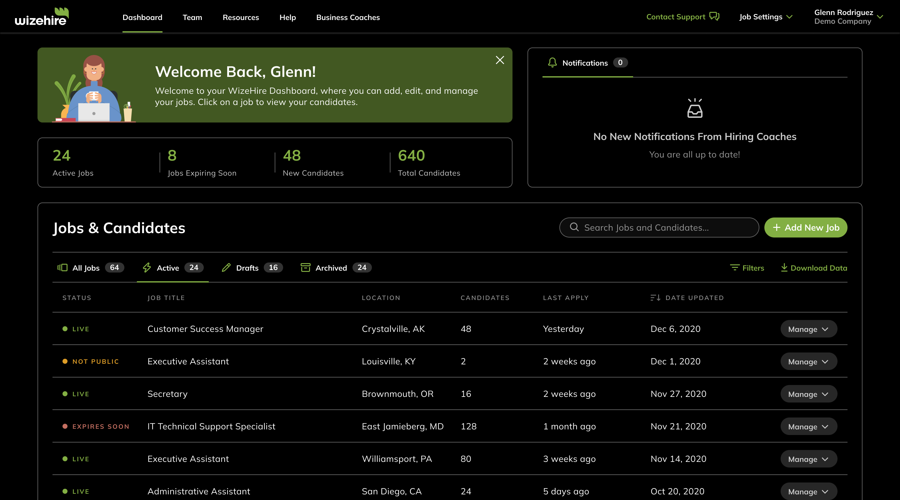
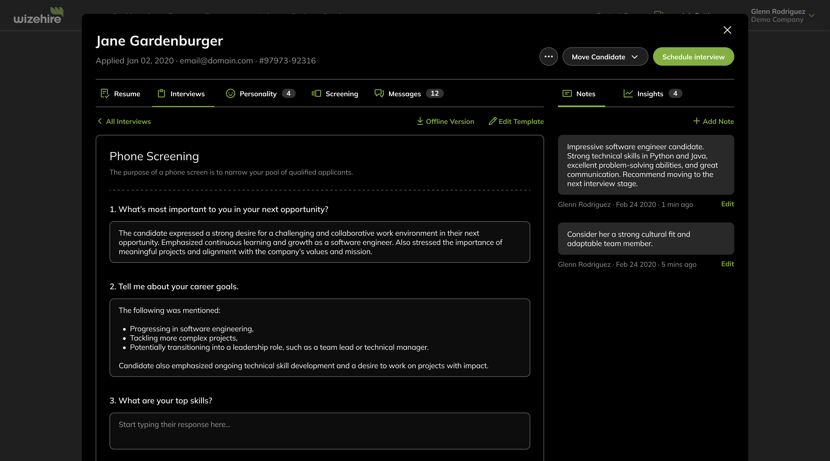
Wizehire is a hiring platform for small business owners. My role at the company was to establish a formal design system to maintain design consistency across all of the company’s products and allow for more effective product development. As part of the project I’ve formalized the use of typography, color, layout grid, and set up a component library on Figma. I also designed several web-based features as well as the initial version of the company’s first iOS app.
Background
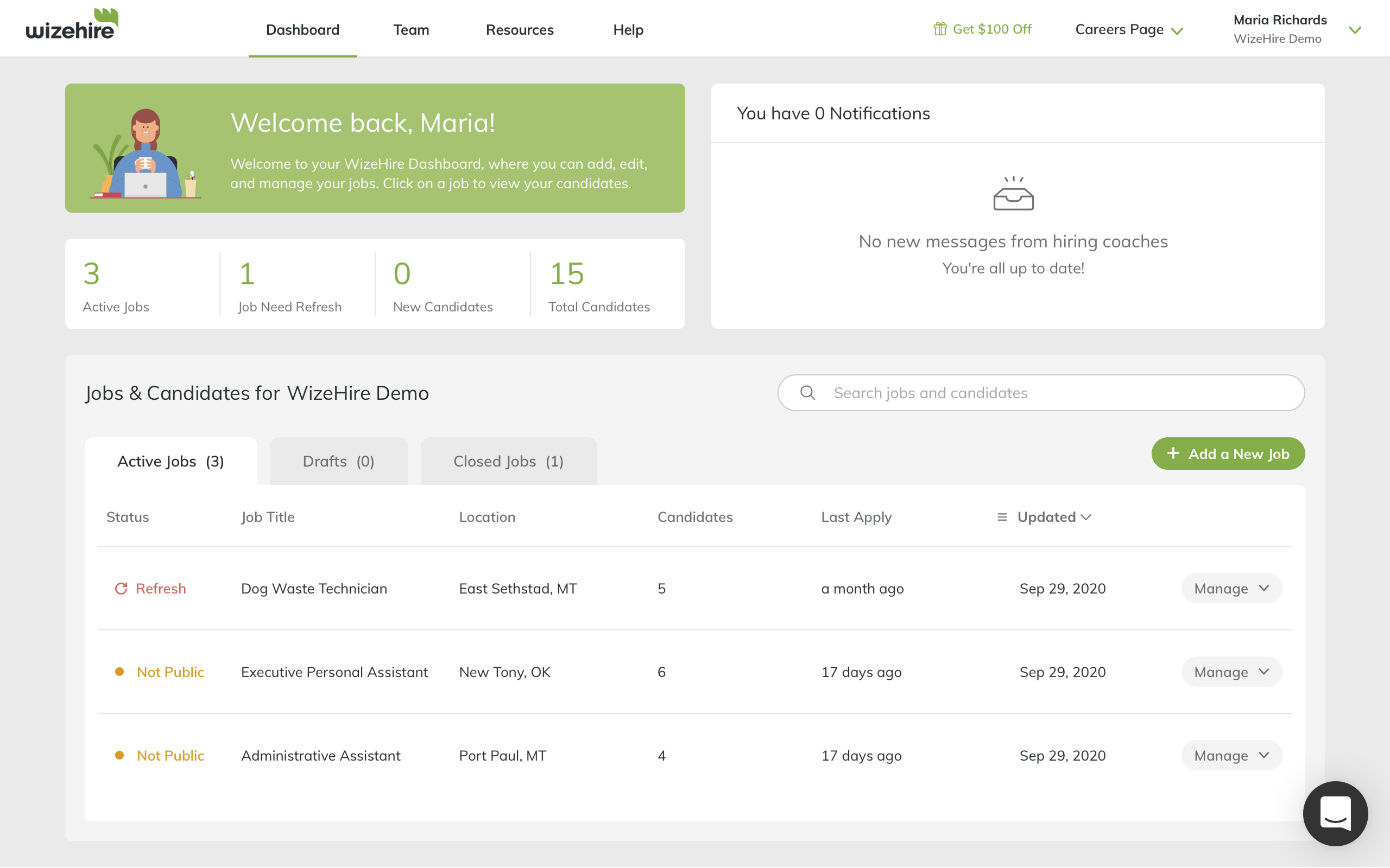
In 2020 Wizehire was growing rapidly as small business owners began adopting digital tools to improve their hiring practices, a trend that was accelerated by the COVID-19 pandemic. Wizehire initially approached me to design several new product features that were being requested by the company’s customers. Soon after I started working on my first project, though, it became apparent that the existing design system couldn’t keep up with the rapid pace of growth at the company and urgently needed updating. I was tasked with updating the design system as well.
Starting Point
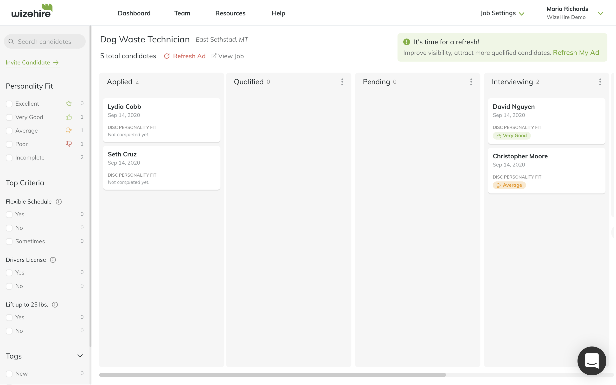
In my initial assessment, the core issue I encountered was that components had been built in isolation as individual features were developed. This resulted in multiple button styles, inconsistent spacing patterns, and slight color variations across different parts of the platform. This fragmented approach was slowing down development as engineers had to make design decisions on the fly, all while the user experience suffered from a lack of cohesion. These challenges intensified as customer requests for new features increased, highlighting the urgent need for a unified design system.
Design Process
I met with the PM and the Lead Engineer on the project twice a week to discuss progress and gather feedback. At each session, I walked the team through the latest round of iterations, presented the pros and cons of each solution, and asked for input. We then decided what the focus of the next round should be. This tight feedback loop helped us keep a good cadence throughout the entire design process, from initial scoping to developer hand-off.


Designing the System
Working on new product features helped me to take stock of the different styles, components, and patterns used throughout the product. Once I had a firm grasp of the way things worked I started listing the improvements that could be made, which elements could be consolidated and which eliminated altogether. I then began setting up the new design system in a separate Figma file.
The areas I focused on were:
- Layout grid consistent with the grid system implemented in production.
- Accessible, scalable color palette based on HSL values.
- Typography styles including headings, body text, and labels.
- Scalable SVG icon library based on GitHub’s Octicons.
- Components library with support for auto-layout and variants in Figma.
- Template library of the main views showcasing best-practices.
The Figma file evolved side-by-side the new features I was working on, allowing me to see what worked and what didn’t in real time. It helped me refine various aspects of the design system and ensure better alignment with the direction the company was heading towards.


Product-Driven System Design
The project demonstrated that the most effective design systems emerge from real product needs rather than abstract principles. By developing the system in parallel with new features, I was able to test and refine components against actual use cases, ensuring each element served both user needs and business goals. This iterative approach resulted in a more robust foundation that reduced design-to-development hand-off time and enabled the team to maintain consistency across all user touch points.